Saturday, 28 January 2017
Friday, 27 January 2017
Eiko Ishioka
 After having spoken to director Terry Hall over Skype I decided to research a Japanese costume designer and director that he suggested named Eiko Ishioka, known for Bram Stoker's Dracula (1992), The Fall (2006), Immortals (2011) and Mirror Mirror (2012). I decided to look at Bram Stoker's Dracula (1992) and The Fall (2006).
Bram Stoker's Dracula (1992)
Firstly I looked at her work in Bram Stoker's Dracula. Her costume designs in this seem slightly abstract and I can assume having not seen the film that the different costumes of the three women are either from different time periods that they may have become vampires or different countries. However I do like this idea as it presents an abnormality in the characters and that is definitely something that is key to my film with the Woodland Queen and the nymphs being classed as "other" in the filmic universe I have created.
 The Fall (2006)
I also looked at the film The Fall which Eiko Ishioka worked on the costume design. The film is a fantasy about a bedridden stuntman in the 1920s named Roy (played by Lee Pace) who tells a little girl, Alexandria a fantasy story about exotic heroes and far off places which reflects his state of mind. As the story continues the stuntman's health deteriorates and so does his story. This film sounds very interesting and I immediately started looking at the aesthetic of film as well as Eiko Ishioka's costume designs. The film seems very abstract and this is presented through the characters and their whole design. For instance, Lee Pace's character (see image) as the Masked Bandit is dressed in a what reminds me of some sort of Spanish style alike to that of a matador. I considered that this could be a metaphor for the bull being his sanity whilst he fights against it and his drug addiction. I definitely considered my short film's characters' natures when I came up with the concept ideas of their costumes and now having looked at Eiko Ishioka's work on this film has made me perhaps explore a more fantastical or unworldly element to the nymphs.
Thursday, 26 January 2017
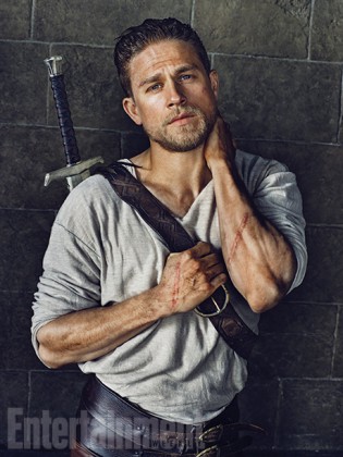
Fantasy Photoshoot Examples: King Arthur
Having evaluated EMPIRE magazines in depth I decided to look at a different magazine: Entertainment Weekly. I did this in order to compare the shots used in the magazine instead of the content of the article.
Although this film has not yet been released I decided to look at the new film directed by Guy Ritchie. The two shots I found online from Entertainment Weekly were both obviously from photoshoots and most of the ones that I could find display the main character instead of any of the others such as the villain or the mysterious sorceress shown in the trailer. This I thought was key as the audience obviously require images of the main character more than the other characters. This is useful regarding my magazine article I will be producing as it means that I should perhaps focus more on the main character than the others. One thing that seems to be evident in the photos taken for Entertainment Weekly is that they are (like fantasy film posters) colour coded to be more greys and blues than bright colours. This I will definitely take into account for not only my film poster but also for my magazine article for colour coding the photoshoots with filters that are more grey or dull in tone.
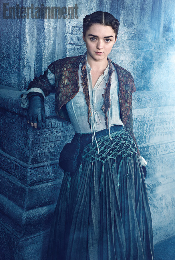
Fantasy Photoshoot Examples: Game of Thrones
Game of Thrones
Although not a film, I decided to also analyse the photoshoots done for Game of Thrones. The first image presents Jon Snow (left, played by Kit Harrington) and Daenerys Targaryen (right, played by Emilia Clarke) and is very bland as well as having been obviously been done in a studio. I do not like this idea in regards to the photos I will need to take for my magazine as it does not give the audience a clear idea of who the characters are or what the story is even about apart from the fact that Daenerys is clearly highborn whereas Jon looks like a warrior. Alternatively looking back on the poster I think was a very strategic move used to please the fans of the series in regard to Jon's heritage which was revealed in season six whilst this poster is supposedly from season two! The poster in the middle of Arya Stark (played by Maisie Williams) really emphasises on her character's development from the tom-boy daughter of Ned Stark to a training assassin. Also the background of the poster is supposedly inside the Hall of Faces however the stone column she is leaning against is not dark stone like it should be but covered in frost and ice which links back to her character's origin as a daughter of Ned Stark whose house words are "Winter is coming". Finally I chose to look at a poster of three characters who could arguably be three of the most powerful women in the series: Cersei Lannister (Lena Headey), Margaery Tyrell (Natalie Dormer) and Daenerys Targaryen. This photo has obviously not be taken in studio and is actually on set of the film making the audience aware of the setting of the series or the season from which the photo is from. The photo portrays the top three female claims to the Iron Throne and therefore sets competition for the season it is for. This could be a good idea in regards to the magazine article having perhaps the Woodland Queen with Melodie and Sienna. Also, all the photoshoots are of the character(s) looking into the camera although not purposefully breaking the fourth wall. This is another factor I must consider in regards to my short film's article as it seems common in the photos I have chosen to study.


Wednesday, 25 January 2017
EMPIRE Magazine Articles
Having already reviewed a selection of articles from EMPIRE magazine that I had at home stacked in my bookshelf I decided to evaluate them further to determine exactly what I like and would perhaps like to use in my own article. I selected my two favourite articles to evaluate in depth which were the articles on Pride + Prejudice + Zombies (PPZ) and Dr Strange.


Pride + Prejudice + Zombies
In my previous post I mentioned how I liked the aesthetic of the article and from the pictures above I wanted to analyse exactly what I like. First of all I really like the colour scheme of dull greys and natural colours. I think it emphasises on the tone of the film without making it seem dull and looks very realistic even though the film is set in a dystopian nineteenth century England. I also mentioned the two page poster at the start of the article of Mr Bingley fighting off a hoard of zombies (or at least attempting to). I think this is very effective because it highlights exactly what the film is about as well as portraying the characters. For instance, Mr Bingley throughout the film seems to be so afraid of the zombies that he cannot fight them which often results in him almost killed before the intervention of Mr Darcy. Each of the three shots shown in the pictures highlight exactly how the characters are presented in the film which I really want to try and use myself when it comes to making my own magazine article.
Regarding the content of the article I like the idea of asking my actors to say something about their characters for a piece I could write - a bit like what the PPZ article does with Mr Darcy and Elizabeth Bennet - as well as a short piece of context (also shown in article with Lady Catherine de Bourgh). I also like the idea of talking about the filing locations, however I would not want to write a section on the director (me). Ultimately I like the idea of how the article selects both shots from the film itself and shots from photoshoots done with the actors which I will take note of when making my magazine article on my short film.


Dr Strange
In comparison to the PPZ article I decided to also look at a more recent article that has been done by EMPIRE that I also like. I therefore chose the Dr Strange article which published only a couple of months back. Similar to the PPZ article it has a two page poster at the beginning of the article, however this time it portrays the main character (Strange). As this seems to be a common structure for EMPIRE I am considering something similar myself for my article. I like how the poster title is surrounded by mystical symbols which really emphasises on theme of magic throughout the film and therefore makes the reader aware that the film is about someone or people with supernatural abilities. This idea of using symbols is continued throughout the article which is another aesthetic that I like about the article.
Tuesday, 24 January 2017
Certificate Rating
Similar to feature films, short films are also rated for specific audiences ranging from a U all the way to 18. I decide to look at different film certificate ratings (according to the British Board of Film Classification) so that I can rate my short film.
U - Universal
U rated films are suitable for all ages and the content of the film is suitable for children aged four and over.
PG - Parental Guidance
PG rated films are suitable for all ages however some scenes may be unsuitable for young children and it therefore normally aimed for children over the age eight years old. The film may also contain mild language, sex/drug references or contain mild violence as long as it matches the context such a fantasy violence which the children will know is not real.
12 and 12A
12 and 12A rated films are considered unsuitable for young children under the age of twelve and 12A films are considered ok for children as long as they are accompanied by an adult. 12 and 12A rates films may contain mild mature themes, discrimination, soft drug use, infrequent strong language, moderate violence, sex references and nudity.
15 - Only suitable for 15 years or older
15 rated films are only suitable for people who are fifteen or older. Films that are rated like this may contain adult themes, hard drugs, regular use of foul language and limited use of strong language, strong violence and sex references and mild nudity.
18 - Only suitable for 18 years or older
18 rated films are only suitable for adults meaning that there are almost no limitations for the content in the film and may contains strong violence, sex references, strong language etc.
Once I had looked at these ratings I decided that my short film would probably be rated as a 15 due to the violence in the film which may disturb some viewers under the age of fifteen.
Monday, 23 January 2017
Iconic Fantasy Film Posters


I also looked at posters for The Shannara Chronicles and surprisingly found myself drawn towards the darker shade of poster (left) instead of the more popular bright one (right). This supports my discovery on my previous post that fantasy and historic films are normally coloured in shades of grey and blue. Personally I found the one of the left to be a bit overcrowded with five characters (Wil, Amberle, Allanon, Eretria, Eventine) all shown although I liked the colour scheme. However in the second poster on the right I found that the colour scheme was far too bright for the series due to it's dark themes. I did like the simplicity of only showing the three main characters instead of cramming the characters onto one poster as seen with the poster on the left.


Sunday, 22 January 2017
Iconic Historic Film Posters


As part of my coursework I also have to create a film poster for my film. Therefore I decided to look at iconic film posters from the fantasy genre. Firstly I decided to look at a selection of posters based off medieval legends due to the medieval themes in my short film. I decided to firstly look at the posters from the television series Vikings. I like the simplicity of the poster of the Vikings symbol as it is the series symbol submerged under water which links to the key themes of the vikings setting sail to discover the world. The design of the symbol being entirely made out of blood is also very interesting and follows the continuous theme of battle and war throughout the series. I also like the design of the symbol as the runes combined in the symbol mean family life, growth and life, brotherhood, technology and ship building, violence and the marks of conflict . This subtle collaboration of themes throughout the series is very clever and I like this idea. I decided to look at a different poster from the same season of Vikings to compare. I chose one of the singular character posters which is often a stereotypical idea of both television shows and films to produce a collection of posters with singular characters portrayed on them. The poster I chose to look at continues the theme of blood and conflict with the character of Bjorn striding through bloodstained tides carrying a spear and shield.
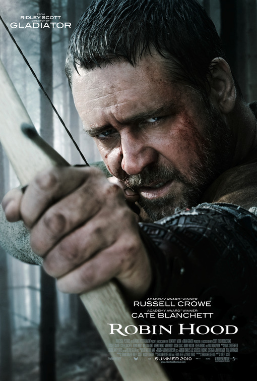
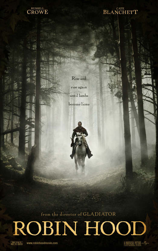
I then looked at the poster to the Ridley Scott film 'Robin Hood' starring Cate Blanchett and Russell Crowe. Unlike television series a film poster seems to portray just the main character and therefore makes the audience focus solely on that character. Something that I noticed with both the 'Robin Hood' poster and the 'Vikings' poster of the characters is that the colour scheme is very cold as it is full of greys and blues. Noticeably both posters also have the character breaking the fourth wall and looking directly into the camera. The character of Robin Hood is shown looking directly into the camera as though he is aiming to shoot the audience with the arrow knocked onto the bow whilst the poster of Bjorn from Vikings has him looking directly into the camera as he emerges from crimson water. Therefore it is recognisable that both films seem to focus on the conflict within the film/television show.
Subscribe to:
Posts (Atom)