Showing posts with label Film Poster. Show all posts
Showing posts with label Film Poster. Show all posts
Wednesday, 12 April 2017
Thursday, 9 March 2017
Photoshop Tutorials
One of the obstacles that I have encountered during my media A2 coursework is that I have no experience with editing software such as Photoshop which I will be using to design my film poster for my short film. I therefore decide to look at a number of tutorials online to understand what I need to do in order to make a good film poster.
Monday, 23 January 2017
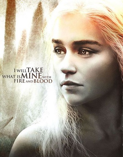
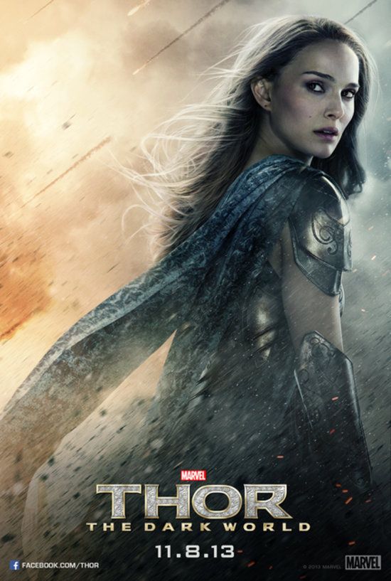
Iconic Fantasy Film Posters


I also looked at posters for The Shannara Chronicles and surprisingly found myself drawn towards the darker shade of poster (left) instead of the more popular bright one (right). This supports my discovery on my previous post that fantasy and historic films are normally coloured in shades of grey and blue. Personally I found the one of the left to be a bit overcrowded with five characters (Wil, Amberle, Allanon, Eretria, Eventine) all shown although I liked the colour scheme. However in the second poster on the right I found that the colour scheme was far too bright for the series due to it's dark themes. I did like the simplicity of only showing the three main characters instead of cramming the characters onto one poster as seen with the poster on the left.


Sunday, 22 January 2017
Iconic Historic Film Posters


As part of my coursework I also have to create a film poster for my film. Therefore I decided to look at iconic film posters from the fantasy genre. Firstly I decided to look at a selection of posters based off medieval legends due to the medieval themes in my short film. I decided to firstly look at the posters from the television series Vikings. I like the simplicity of the poster of the Vikings symbol as it is the series symbol submerged under water which links to the key themes of the vikings setting sail to discover the world. The design of the symbol being entirely made out of blood is also very interesting and follows the continuous theme of battle and war throughout the series. I also like the design of the symbol as the runes combined in the symbol mean family life, growth and life, brotherhood, technology and ship building, violence and the marks of conflict . This subtle collaboration of themes throughout the series is very clever and I like this idea. I decided to look at a different poster from the same season of Vikings to compare. I chose one of the singular character posters which is often a stereotypical idea of both television shows and films to produce a collection of posters with singular characters portrayed on them. The poster I chose to look at continues the theme of blood and conflict with the character of Bjorn striding through bloodstained tides carrying a spear and shield.
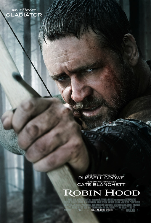
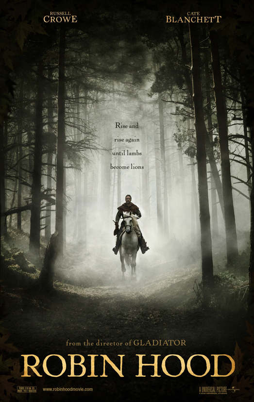
I then looked at the poster to the Ridley Scott film 'Robin Hood' starring Cate Blanchett and Russell Crowe. Unlike television series a film poster seems to portray just the main character and therefore makes the audience focus solely on that character. Something that I noticed with both the 'Robin Hood' poster and the 'Vikings' poster of the characters is that the colour scheme is very cold as it is full of greys and blues. Noticeably both posters also have the character breaking the fourth wall and looking directly into the camera. The character of Robin Hood is shown looking directly into the camera as though he is aiming to shoot the audience with the arrow knocked onto the bow whilst the poster of Bjorn from Vikings has him looking directly into the camera as he emerges from crimson water. Therefore it is recognisable that both films seem to focus on the conflict within the film/television show.
Subscribe to:
Posts (Atom)